Bar Graphs
Make Your Own Bar Graph A bar graph is a visual display used to compare the amounts or frequency of occurrence of different characteristics of data
all about bar graphs
Parts of a Bar Graph
Now let's look at the components of a bar graph individually. There is a lot of information in this section so you may wish to jot down some short notes to yourself.
- Graph Title--The graph title gives an overview of the information being presented in the graph. The title is given at the top of the graph.
- Axes and their labels--Each graph has two axes. The axes labels tell us what information is presented on each axis. One axis represents data groups, the other represents the amounts or frequency of data groups.
- Grouped Data Axis--The grouped data axis is always at the base of the bars. This axis displays the type of data being graphed.
|
 |
-
Simple Bar graph
-
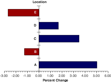
Horizantal Bar Graph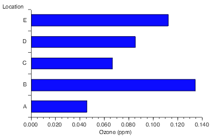
-
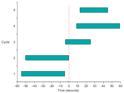
Range Bar Graph
-
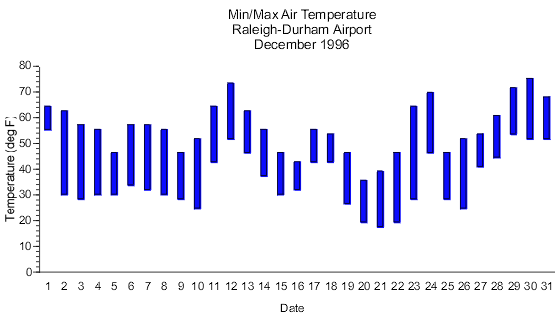
Histogram
-
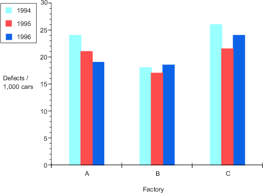
Grouped bar graph
-
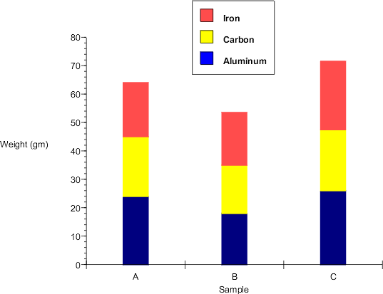
Composite bar graph
Comments (18)
Anonymous said
at 9:49 pm on Oct 26, 2007
that is beautiful
Anonymous said
at 1:24 pm on Oct 29, 2007
it's fantabolous!
lovinnn the font
Anonymous said
at 1:32 pm on Oct 29, 2007
WOW BRANDON! your totally awesomely very smart.
Anonymous said
at 1:48 pm on Oct 29, 2007
UR QUITE THE BALLER YER SELF!
NICE [PAGE]
Anonymous said
at 9:49 am on Nov 5, 2007
im lovin it. very ncie examples.
Anonymous said
at 9:53 am on Nov 5, 2007
nice page it is fantasico
Anonymous said
at 9:58 am on Nov 5, 2007
NICE page... letters a little some some people can't read them
Anonymous said
at 10:19 am on Nov 5, 2007
Good page!!! the font is a little small, though. maybe you could add more links!
Anonymous said
at 1:01 pm on Nov 5, 2007
Good page. You have nice graphs.
Anonymous said
at 1:10 pm on Nov 5, 2007
really good, but i think you should use less space on the top
colorful graphs
Anonymous said
at 1:22 pm on Nov 5, 2007
Why there is so much space on the top?
Alex L. said
at 2:33 pm on Nov 5, 2007
You should get rid of teh blank space on top.
Anonymous said
at 2:37 pm on Nov 5, 2007
you need more examples
Anonymous said
at 2:38 pm on Nov 5, 2007
I like your page but it is too formal and has too much advanced vocabulary.
Anonymous said
at 5:17 pm on Nov 5, 2007
i like it. there are so many visual aides. but i do agree with Lydia. You might wanna tone down the vocab. lol. anywayz. it's great. there are lots of examples.
Anonymous said
at 7:40 pm on Nov 5, 2007
nice page brandon, but i think you should cut down a little bit on those big words your using. overall nice page n visuals.
Anonymous said
at 8:20 pm on Nov 5, 2007
Nice page, but it's copied word for word from one of your links. It's good that you made a link to the page you took the information from, but could you please show that YOU understand what you're saying?
Anonymous said
at 11:44 pm on Nov 14, 2007
Marcia's comment is right on. You would have done a better job of describing bar graphs for us than the people whose work you stole.
2 of 4 points
8.5 of 12 total project points.
You don't have permission to comment on this page.